In the bustling world of graphic design, emphasis is the secret sauce that transforms a good design into a great one. It’s like the star of a show, drawing attention and making sure the audience knows where to look. Without it, designs can feel flat and uninspiring, like a pizza without toppings—who wants that?
Emphasis in graphic design serves as a tool to highlight key elements, drawing attention and creating focus. It establishes a hierarchy among visual components.
Definition of Emphasis
Emphasis refers to the technique that designers use to make specific elements stand out. This can be achieved through size, color, contrast, or placement. For instance, a larger headline in bold red can capture a viewer’s attention more effectively than smaller, standard text. Designers often utilize these methods to convey importance. Creating a focal point simplifies navigation through the design and ensures clarity.
Importance of Emphasis
Emphasis plays a critical role in communication through visual design. It guides viewers’ eyes to the most important information first. Without effective emphasis, designs risk becoming cluttered and confusing. Strong emphasis can enhance user experience by directing focus where needed. Adding relevant elements like images or icons provides visual support and strengthens messages. Prioritization through emphasis leads to clearer, more impactful design outcomes.
Techniques to Create Emphasis
Emphasis in graphic design can be achieved through various techniques. Designers often rely on strategic choices to guide viewers’ attention.
Color Usage
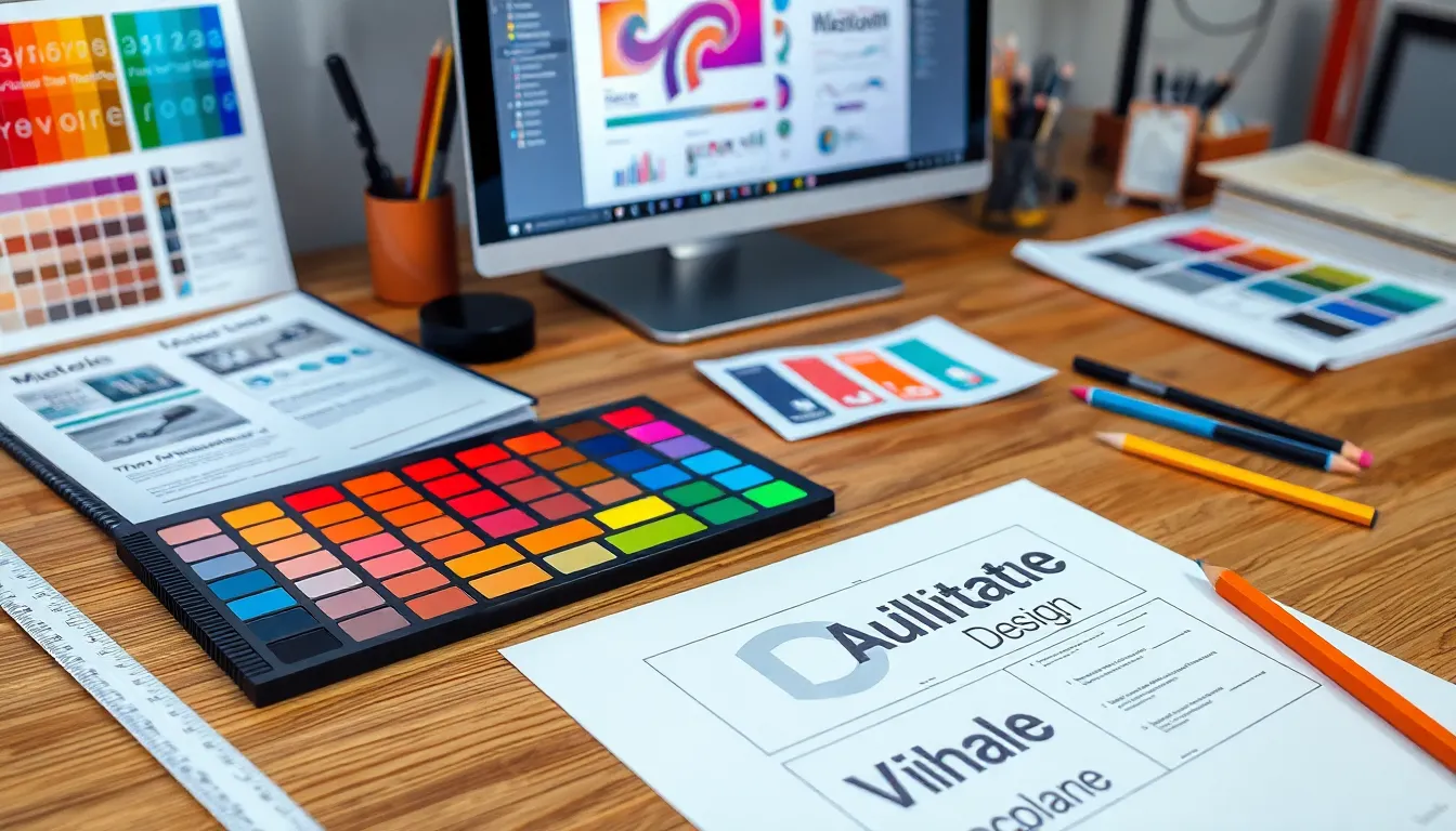
Color serves as a powerful tool to create emphasis. Using bright colors against a muted background draws the eye instantly. For instance, a vivid orange button on a gray page stands out, prompting action. Designers can also adopt a monochromatic scheme to highlight specific elements through saturation differences. By contrasting warm and cool colors, they create visual interest and hierarchy. These techniques help establish focal points that engage and motivate the audience.
Typography Choices
Typography plays a crucial role in establishing emphasis within designs. Bold fonts capture attention when used for headlines or key messages. Designers often opt for larger type sizes to signify importance. Different font styles can enhance the overall message, using serif fonts for traditional contexts or sans-serif for modern aesthetics. Additionally, varying font weights and styles within the same family can reinforce significance. Clear distinctions in typography guide readers through content efficiently, making critical information easier to access.
Layout and Composition
Layout and composition significantly influence emphasis in graphic design. Placing key elements centrally draws immediate attention. Designers often employ the rule of thirds, positioning focal points along intersecting lines for visual balance. Negative space enhances emphasis by providing breathing room around important elements. Grouping related content together can establish clear visual hierarchies. Aligning elements with purpose strengthens the overall message and aids navigation. Proper composition ensures that viewers engage with the most critical information intuitively.
Examples of Emphasis in Graphic Design
Emphasis in graphic design manifests through various iconic works and case studies, showcasing effective techniques.
Iconic Designs
Iconic designs often utilize bold colors and prominent typography to capture attention. Consider the Coca-Cola logo, where the bright red instantly draws the viewer’s gaze. Another example is Apple’s advertising, which features sleek designs with a strong focus on product images. Designers achieve impact by using size and contrast, ensuring the most important elements stand out. These designs illustrate how effective emphasis not only conveys information but also creates lasting impressions.
Case Studies
Case studies reveal the practical application of emphasis in real-world projects. One compelling example is the “Got Milk?” campaign, which maximized visual focus through clever imagery and strategic text placement. Another notable case is the Airbnb website redesign that employed large visuals and minimal text to highlight properties. Both examples show that careful consideration of emphasis enhances user engagement and fosters a clearer message. By analyzing such cases, designers can learn valuable lessons about prioritizing critical elements in their work.
Common Mistakes in Applying Emphasis
Effective emphasis enhances designs, but many designers make critical mistakes that diminish their impact. Identifying common pitfalls helps improve visual communication.
Overuse of Elements
Overusing design elements dilutes emphasis. When every aspect of a design features bold colors, varied fonts, or large sizes, the focus shifts away from key components. This clutter results in confusion rather than clarity. Striking the right balance is essential. For example, employing a single dominant color for the main message creates visual hierarchy without overwhelming the viewer. Prioritizing certain elements while allowing others to recede promotes effective communication. Eliminating unnecessary embellishments ensures that the focal points stand out, inviting the audience’s attention to critical information.
Lack of Consistency
Consistency is vital for maintaining emphasis. Inconsistencies in color schemes, typography, or layout disrupt the viewer’s experience. Designers often overlook the power of uniformity, assuming varied styles enhance visual interest. Contrarily, inconsistent elements can confuse audiences and obscure key messages. For meaningful emphasis, cohesive visual choices across a design strengthen its overall impact. Using similar fonts and consistent color palettes enhances recognition and trust. Following established guidelines creates a more polished design, ensuring that important information captures attention without distractions.